.png) Get Started
Get Started

Right now, a support queue is probably filling with the same questions, and the FAQ page is supposed to absorb them before they reach the inbox. The problem is that many teams publish a thin list of generic answers, then wonder why users still open tickets, bounce, or ask the same thing in Discord, Slack, email, and chat. A strong example of a FAQ page does more than answer questions, it organizes demand, reduces friction, and gives people a clear next step. That is why the best pages feel more like a living support system than a static page. For teams trying to automate customer service for small businesses without losing clarity, the FAQ is often the first place to get serious about structure.
Discord's Help Center is a strong example of a FAQ page because it behaves like a support hub, not a simple question list. The page is organized around clear categories such as Basics, Account Settings, Server Settings, and Known Issues, which matters because users rarely arrive with a single clean question. They arrive confused, impatient, or mid-incident, and the layout helps them move from broad intent to specific resolution fast. The friendly tone lowers the pressure for first-time users, which is a real advantage for community products where support can feel intimidating.
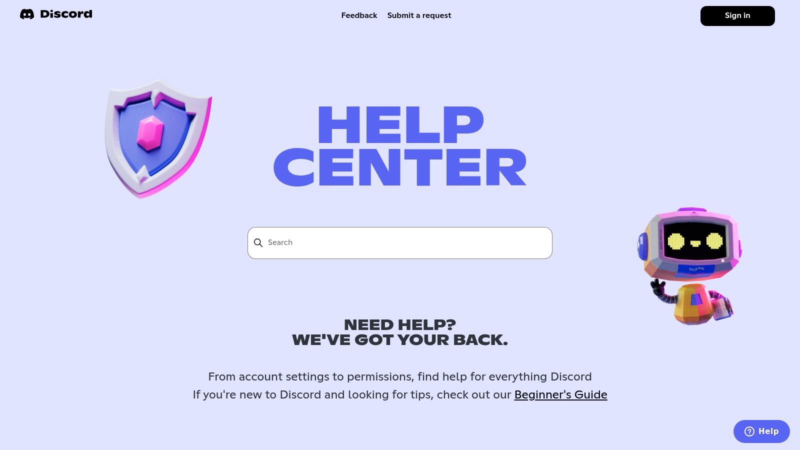
Discord does three things especially well. First, it separates onboarding from troubleshooting, so new members can start with beginner guidance while experienced users jump straight into bugs or account issues. Second, it keeps a visible “Submit a request” path, which is important because self-serve should reduce tickets, not trap people. Third, it gives developer support and app directory questions their own space, which prevents advanced topics from burying everyday help.
Practical rule: If your community product has beginner users and power users in the same help center, split them early. One page should not force everyone through the same path.
The trade-off is tone and depth. Discord's voice feels approachable, but that same playfulness may not fit regulated or enterprise-heavy products. The navigation can also take multiple clicks for advanced topics, which is acceptable for a broad consumer audience but less ideal when the user needs an answer immediately. For teams building with Mava's Discord FAQ and knowledge base workflow, the takeaway is simple, import the same category logic, then let AI surface the most likely answer before escalation.
Slack's Help Center shows how a FAQ example can serve both onboarding and operational support without feeling fragmented. The page uses topic hubs like Getting Started, Using Slack, and Admin, which is exactly what enterprise buyers expect when they're trying to support end users, workspace admins, and internal IT teams at the same time. It also links out to Slack Status, a small but important trust signal that keeps incident communication separate from ordinary product help. That separation matters because support content and service status solve different user anxieties.
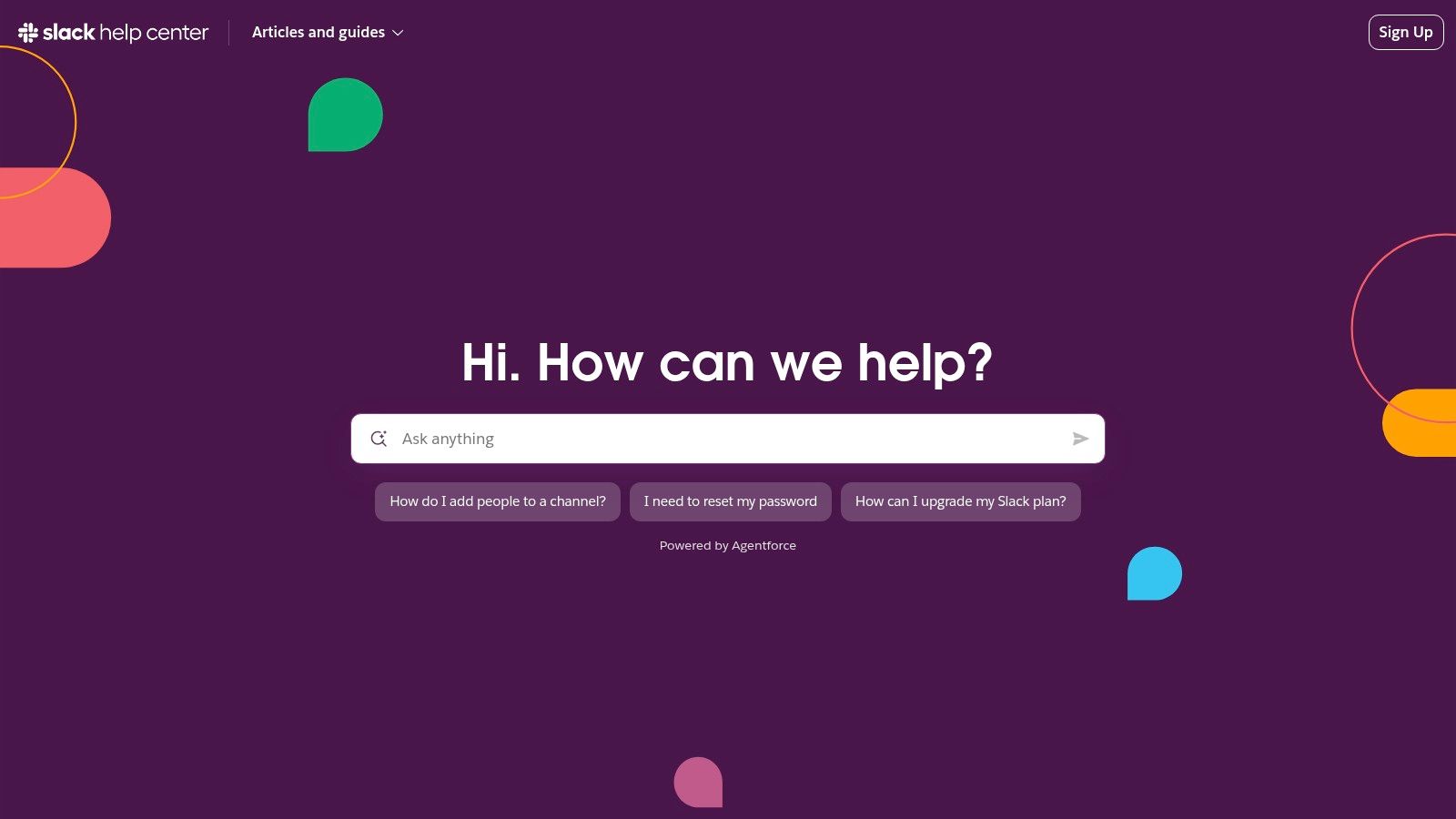
Slack's article library is built around consistent, actionable steps. That consistency helps teams because each page teaches users what to do, not just what something means. The region selection and policy links also matter, because enterprise users often need compliance clarity before they trust the answer enough to act on it. A support center that hides those details tends to create more tickets later.
The downside is that some paths push users toward contact forms, and those forms often require workspace context or sign-in. That's fine when the issue needs account-specific handling, but it can slow down simple questions that should have been answered inline. A good FAQ page should reserve forms for cases that need human intervention, not use them as the default exit.
For community and SaaS teams, Slack is a reminder that the best support hubs are organized around roles, not just topics. Admins need policy details, new users need setup guidance, and both groups benefit from a clean, repeatable article format. Mava's guide to AI-powered Slack support fits naturally here because AI can route the right answer to the right user without making them search through the entire library.
Stripe's Support Center is one of the clearest example of a FAQ page models for policy-heavy products. The design is search-first, and the answers are intentionally short, which fits a product where users need precise guidance on verification, payouts, disputes, and account handling. Stripe also uses contextual trust and safety guidance, including reminders about verifying official pages, which is especially valuable in categories where impersonation and fraud are real risks.

Stripe's strength is not volume, it's precision. The support center distinguishes between customer-focused and merchant-focused content, which keeps people from landing in the wrong policy lane. It also offers multiple escalation paths through linked contact articles, including email, chat, and callback options. That matters because payment and verification issues often need a human review after the user has completed the basic checklist.
The trade-off is complexity. Some content is localized or plan-specific, so a user may need to do a little more navigation to find the exact answer that applies to their account. Live support availability also varies by account or plan, which is standard for payment infrastructure, but still worth accounting for in the FAQ design itself. If a page depends heavily on eligibility, it should say so early and clearly.
Useful pattern: For compliance or payments, write the quickest safe answer first, then link to the deeper policy page. Users do not want a long explanation before they know whether they're blocked.
Stripe is a good reminder that concise FAQ answers are not a limitation, they're a control mechanism. Short, focused entries reduce ambiguity and keep risky support topics from drifting into guesswork.
GitHub Support Docs blends documentation, FAQ, and escalation in a way that works for technical users. The support tier structure, Community, Standard, Enterprise, and Premium, is presented clearly, which is important because entitlement confusion can create more friction than the actual issue. GitHub also surfaces AI-assisted answers before a ticket is created, which shows how modern FAQ systems can reduce repetitive requests without removing human help.

GitHub's architecture is dense, but that density is also the point. Developers often need policy, status, and ticketing details in the same place, because they're diagnosing a problem while also checking what support they're entitled to receive. Guided flows for creating and viewing tickets keep the support process transparent. That reduces the “where do I even start” problem that usually inflates ticket volume in technical products.
The trade-off is readability for casual visitors. A docs-heavy format can feel slower than a lightweight FAQ page, especially if the user only needs one quick answer. Premium support features also belong to enterprise plans, so the experience naturally changes by audience. That's not a flaw, but it does mean the page has to do more work to orient each user correctly.
A strong implementation tip for AI tools like Mava is to mirror GitHub's structure in the knowledge base. Map answers by plan entitlement, support tier, and issue type, then let the AI surface the likely route before the user opens a ticket. That keeps support from turning into a scavenger hunt.
Notion's Help Center is a clean example of a FAQ page for a product that serves both newcomers and advanced users. The search-centric layout makes sense because Notion users tend to arrive with very specific problems, such as setup, troubleshooting, or workspace behavior. Its issue-based categories keep the page calm and usable, which matters in a product where cognitive load can already be high.

Notion's strength is restraint. The page doesn't try to do everything at once, and that helps users focus on the question in front of them. Its mix of how-to content and troubleshooting articles is the right pattern for a SaaS help hub because users often need both education and recovery. When self-serve fails, the support path remains available, which keeps the page from becoming a dead end.
The downside is that advanced configuration content can be spread across multiple subsections, which adds a few extra clicks. That is a fair trade if the page stays readable, but it can frustrate users who already know exactly what they need. Sign-in requirements can also slow down support requests when the user is locked out or troubleshooting from another device.
Notion works because the page feels calm enough for beginners and organized enough for power users.
For teams building a support hub from scratch, Mava's FAQ article template guidance is useful because it encourages the same mix of concise answers, scannable structure, and clear escalation links. That combination is what keeps a help center from feeling bloated as the product grows.
Shopify's FAQ page is one of the best examples of splitting quick answers from deeper help. The top-level FAQ handles common pre-sales and product questions, while the larger help center covers billing, plans, and advanced documentation. That separation is smart because a visitor comparing plans does not want to scroll through the same depth needed by an active merchant troubleshooting an account issue.

Shopify understands that an FAQ page has two jobs. It has to remove buying hesitation up front, and it has to keep existing users from opening repetitive tickets later. That is why the billing and plan questions are prominent. They set expectations early, before a new merchant starts the checkout process or opens the platform.
The trade-off is that the experience can feel like two different systems. The FAQ and the deeper help center are related, but the transition between them is not always smooth. Some merchant support also requires account sign-in, which is understandable for security reasons but not ideal when the user is just trying to compare options.
The strongest lesson here is architectural. Separate the fast answer layer from the deep documentation layer, then connect them with clear links. That prevents the FAQ from becoming cluttered while still preserving room for detailed support content. For AI support teams, a tool like Mava can help by routing users from the quick question to the exact help article or live handoff path without making them repeat themselves.
Coinbase Help Center is a strong example of a FAQ page for a high-risk category where trust, security, and visibility matter from the first click. The page uses an ask-anything search approach, supported by topic tiles for common account, security, and transaction issues. That setup works because crypto users often arrive with urgent, high-stakes questions, and they want to know whether they can resolve the issue themselves before contacting support.
Coinbase also makes its status and complaint links easy to find, which improves transparency. That matters in a space where users may be dealing with delays, account holds, or security concerns. A page that acknowledges those realities early tends to feel more credible than one that hides escalation until the user has clicked through several layers.
The downside is familiar. Some advanced or account-specific content requires sign-in, and personalized troubleshooting can be gated behind account access. That can create a dead end for users who are locked out or browsing from a device they do not normally use. The fix is not to remove security gates, but to make the public-facing page clearer about what can be solved openly versus what requires account context.
Coinbase is a useful benchmark for any community or SaaS team operating in a sensitive category. The page does not try to be charming first, it tries to be trustworthy first. That distinction matters when support questions can affect money, access, or reputation.
ProductImplementation complexityResource requirementsExpected outcomesIdeal use casesKey advantagesDiscord Help CenterModerate, category-driven structure with search and escalationMedium, content ops, search, ticket workflow, developer docsStrong onboarding and transparent incident communicationLarge consumer/community products needing onboarding and incident updatesFriendly tone, clear categories, robust Known Issues areaSlack Help CenterModerate–High, structured hubs, regional/compliance linksHigh, large article library, tutorials, videos, localizationEnterprise-ready support and consistent how-to guidanceEnterprise customers, admins, global/compliance contextsConsistent actionable articles, compliance links, prominent statusStripe Help & SupportHigh, search-first, policy-heavy, multi-path escalationHigh, concise targeted content, trust/safety guidance, support channelsFast resolution for compliance/financial issues with clear escalationPayments, verification, disputes, high-stakes policy topicsConcise action-oriented articles, multiple escalation paths, trust signalsGitHub Support DocsHigh, integrates docs, support tiers, AI-assisted flowsHigh, tiered support infrastructure, AI tooling, SLA documentationReduced ticket volume and clear entitlement/SLA signalingDeveloper platforms and enterprises with tiered support needsIntegrated policy+escalation, AI assistance, guided ticket flowsNotion Help CenterLow–Moderate, search-centric with clean category layoutMedium, how-to content and troubleshooting articlesLow-friction self-serve for newcomers and power usersSaaS products prioritizing clarity and product educationMinimal design, balanced onboarding and troubleshootingShopify FAQ + Help CenterModerate, split between quick FAQ and deep documentationMedium–High, separate FAQ landing, extensive merchant docsClear separation of pre-sales quick answers and deep supportE-commerce platforms balancing pre-sales and merchant supportTop-level FAQ for quick hits plus comprehensive deep helpCoinbase Help CenterModerate–High, search-first with security and sign-in gatingHigh, security-oriented content, status/complaints, account gatingStrong self-serve deflection and transparency for high-risk issuesFinancial/crypto services with security and compliance needsSecurity-first navigation, prominent status and complaint links
The strongest FAQ pages are not static documents, they are dynamic support systems that keep improving as users ask better questions. The pattern across Discord, Slack, Stripe, GitHub, Notion, Shopify, and Coinbase is consistent. Clear categories, search-first navigation, concise answers, and obvious escalation paths reduce confusion while giving support teams a cleaner operating surface. The most effective pages also keep updating, because support demand changes as products, policies, and user behavior change.
For community-led companies and SaaS teams, the practical move is to treat the FAQ as a knowledge product. Build it from support tickets, chat logs, search queries, and the language customers already use. Then review the results regularly, because the best FAQ is the one that reflects current demand, not last quarter's assumptions. That lines up with guidance on using recent support data, quarterly refreshes, and live search signals to keep answers relevant. It also fits the broader support logic behind AI-powered tools like Mava, where the FAQ becomes training material, a deflection layer, and a routing system at the same time.
A smart setup can also improve internal consistency. If the same answer appears in Discord, Slack, your website, and your help center, users get less conflicting information and agents spend less time rewriting the same explanation. For teams looking to refine search and navigation around support content, search strategies from Ascendly Marketing can be a useful reference point for improving findability across the page. The goal is simple, make the answer easier to find than the ticket form.
Mava helps teams turn support content into an AI-ready FAQ system across Discord, Slack, the web, and email. If the goal is to import existing docs, train AI on real customer questions, and route repetitive issues to self-serve before they hit the queue, visit Mava and see how it fits into a modern FAQ workflow.
.png)
.png)
.png)
