.png) Get Started
Get Started
Support breaks long before a team admits it's broken.
The pattern is familiar. Questions land in Discord, then spill into Slack, Telegram, web chat, and direct messages. Moderators answer the same issue in three places, someone escalates a billing complaint without account context, and a frustrated user gives up because nobody knows which reply is the latest one. The work feels busy all day, but the experience for the user still feels slow, inconsistent, and random.
That's why user experience improvement in community support can't be treated like a design refresh. In conversational channels, UX is the system behind the conversation. It's how fast someone gets routed, whether the answer matches what another teammate said an hour earlier, and whether the handoff from bot to human feels helpful instead of clumsy. When those basics fail, users don't describe it as a workflow problem. They describe it as distrust.
A messy support setup usually starts as a sign of growth. More members join. More channels appear. More edge cases show up. Then the support operation turns into a scavenger hunt.
A user asks in a public Discord channel, gets told to open a DM, then gets redirected to a form, then pings a moderator because nobody replied. Another user asks the same question in Slack and gets a different answer. The team thinks it has a volume problem. Most of the time, it has a user experience problem.
Poor experiences push users away at scale. Baymard-cited data shows 88% of online consumers are less likely to return after a bad experience, and 90% of users have stopped using an app due to poor performance according to the usability statistics collected by VWO. In support communities, that same dynamic shows up as silent churn, repeated complaints, and lower trust in official answers.
A support queue rarely looks broken from inside the team first. It looks broken to the user who had to repeat the problem three times.
Community leaders who want to fix this need to understand the client journey beyond a single ticket. The user's memory of support includes where they asked, how many times they had to restate context, and whether the final answer matched the urgency of the issue.
A cleaner operating model helps. Tools that centralize intake and status make it easier to stop support from fragmenting across channels. A practical example is a ticket bot dashboard for multi-channel support, which reflects the kind of operational visibility community teams need when questions are arriving everywhere at once.
Traditional UX advice often starts with layouts, navigation, and page structure. That's useful for websites. It's incomplete for Discord, Slack, Telegram, and embedded chat.
In community support, UX lives inside an active conversation. The user isn't browsing calmly through a fixed path. They're arriving with urgency, partial context, and an expectation that the channel itself will shape how help works.
A strong conversational support experience usually has four qualities:
That's where generic UX advice often falls short. Research highlighted by Nulab notes a frequently missed angle in user experience improvement: real improvement depends on uncovering hidden needs through research and continuous user involvement, especially for community support flows where the right answer depends on the user's channel, urgency, and prior context in this UX strategies guide.
A static FAQ assumes users will follow a defined structure. Community support doesn't behave that way.
One person asks a vague question in a general channel. Another pastes an error screenshot into a thread. A third user joins midway through the conversation and copies the original issue, but their root cause is different. The same words can mean very different things depending on role, plan, device, geography, and prior history.
That changes how teams should define user experience improvement in support:
Support environmentWeak UX assumptionBetter UX approachDiscord or SlackOne public answer fits everyoneRoute by intent, permissions, and urgencyTelegramFast replies are enoughKeep answers short, clear, and easy to escalateWeb chatThe bot should deflect everythingResolve simple issues fast and hand off with contextCommunity forumSearch will solve discoverabilityStructure posts so repeated issues become reusable knowledge
For support leaders, UX isn't mainly visual polish. It's how reliably users can get to the right answer with the least friction possible.
That means the right format matters as much as the right content. A long help article may be perfect for a website and terrible for a live Discord exchange. A one-line bot answer may be efficient for a known password reset flow and completely wrong for a billing dispute. Better support UX comes from treating conversation design, routing, and escalation as core product decisions.
Support teams need a framework that turns vague ambitions into operating standards. A useful model is CARE.
Without a framework, teams say they want better support. With one, they can define what better means, audit current performance, and decide where to invest next.
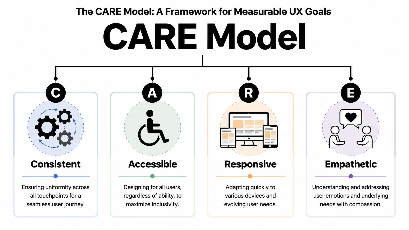
Consistent means users get the same correct guidance wherever they ask. If the bot on web chat says one thing and the moderator on Discord says another, the experience is broken even if both replies sound polite.
Consistency usually depends on three operational habits:
Accessible means support works for the users who show up, not only for the ideal user in a clean demo flow. That includes people on mobile, users with low context, members joining from different geographies, and users who need simpler language or clearer formatting.
Practical rule: If a user needs to decode your support process before they can ask for help, the process is the problem.
Responsive doesn't just mean fast. It means the system adapts appropriately. A duplicate known issue should get immediate guidance. A security concern should bypass the normal queue. A returning user with an unresolved case should not start from zero.
Empathetic is the most misunderstood part of the model. It isn't about sounding warm in every message. It's about understanding the emotional cost of support friction. Asking a user to paste the same evidence into multiple channels feels careless. Sending a generic article to someone with an urgent account issue feels dismissive.
A simple scorecard helps teams operationalize CARE:
CARE elementWhat to inspectConsistentDo answers match across bot, moderators, and docsAccessibleCan users get help in their channel and on their deviceResponsiveAre issues routed by urgency and complexityEmpatheticDoes the workflow reduce repetition and confusion
The business case is already strong. Intechnic's UX benchmark summary reports that every $1 invested in UX can return $100, a 9,900% ROI, and that strategic UX can increase conversion rates by up to 400% in this roundup of UX business statistics. For community-led companies, support sits close to activation, retention, and expansion, so poor UX in support shows up far beyond the help queue.
A team doesn't need a redesign project to start. It needs a standard. CARE gives support leaders one.
Most community teams don't need more theory. They need fixes they can apply this week.
Discord and Slack reward structure. If support is mixed into general discussion, users won't know where to ask, moderators won't know what needs a reply, and repeated questions will keep drowning out real issues.
A better setup usually includes:
For Slack-specific teams, an AI-powered customer support setup on Slack shows the kind of workflows that help separate quick resolutions from cases that need deeper triage.
Telegram support can turn chaotic faster because conversations move quickly and moderation controls often feel lighter than in Discord or Slack. The fix isn't to force heavy process into the channel. It's to make the path to help obvious.
Three tactics work well:
What doesn't work is treating Telegram like a mini help desk without guardrails. Users will still ask in the main flow. The team has to catch that pattern and redirect cleanly.
Web chat has one major advantage over community channels. It can carry context from the page or product state.
That makes it ideal for:
UX problemChannel tacticDuplicate questionsUse canonical answers, threads, and visible known-issue postsSlow triageAdd intake prompts and role-based routingInconsistent answersStandardize macros and connect them to maintained docsLost contextKeep support in structured threads or unified inboxesWrong channel for sensitive issuesCreate fast private escalation paths
Good support UX removes work from the user first. It doesn't just make the team feel more organized.
The strongest support operations don't rely on heroic moderators who remember every thread. They give agents a system that keeps context intact and makes good judgment easier.
A modern day usually starts in a shared inbox, not by hunting across tabs. New issues from Discord, Telegram, Slack, and web chat arrive in one queue. Public posts that need private handling are already marked. Returning users carry their prior conversation history with them.
An agent sees more than the latest message. They see channel, prior steps, suggested responses, tags, and whether the issue looks routine or risky. That changes the work from reactive triage to informed decision-making.
A strong workflow often looks like this:
This reflects a broader UX principle from Wharton: data-driven UX should treat each user as a “segment of one,” using intent and context to personalize routing, self-service suggestions, and handoff logic in Wharton's discussion of data-driven user experience.
Agents lose time when the system forces them to do low-value work manually.
That includes:
A unified setup helps avoid that. Platforms such as Zendesk, Intercom, Front, and Mava are built to centralize conversations across channels. In Mava's case, the product combines a shared inbox with AI support workflows for Discord, Slack, Telegram, and web chat, which fits teams handling community-first support rather than only email tickets.
The agent should spend attention on nuance, judgment, and reassurance. Software should handle recall, routing, and repetition.
When that split is clear, agents become better at the work users notice.
AI improves support UX only when it shortens the path to resolution. When it blocks access to a human, repeats irrelevant answers, or ignores urgency, it becomes another source of friction.
The right question isn't whether to automate. It's which parts of the experience should feel instant, and which parts should feel human.
A useful mental model is the user journey from first message to final resolution.

Automation is strongest when the issue is common, well-documented, and low-risk.
Good candidates include:
The AI should be trained on maintained knowledge sources such as a website, GitBook, or internal help content. If the source material is outdated, the bot won't create efficiency. It will scale confusion.
A practical walkthrough of automating customer support across channels is useful for teams mapping where AI should resolve directly versus where it should prepare a human handoff.
The handoff itself matters just as much as the automation.
A handover should happen when the issue is complex, sensitive, urgent, or clearly unresolved after the first automated attempt. Users shouldn't have to fight the bot to earn human help.
A good handover passes along:
That way, the human starts with context instead of interrogation.
The fastest way to damage trust with AI is to over-automate.
Avoid these patterns:
Automation should feel like a skilled assistant standing next to the team, not a locked door in front of the user.
Support UX improves when teams measure behavior, not opinion alone. The dashboard should show where users succeed, where they stall, and which parts of the system create unnecessary effort.
IBM's UX guidance recommends defining goals first, then measuring with operational metrics, analyzing pain points, implementing changes, and re-testing. It also highlights metrics such as task success, task duration, and error frequency, with analytics dashboards helping teams find where users “hit a wall” in IBM's overview of user experience measurement.
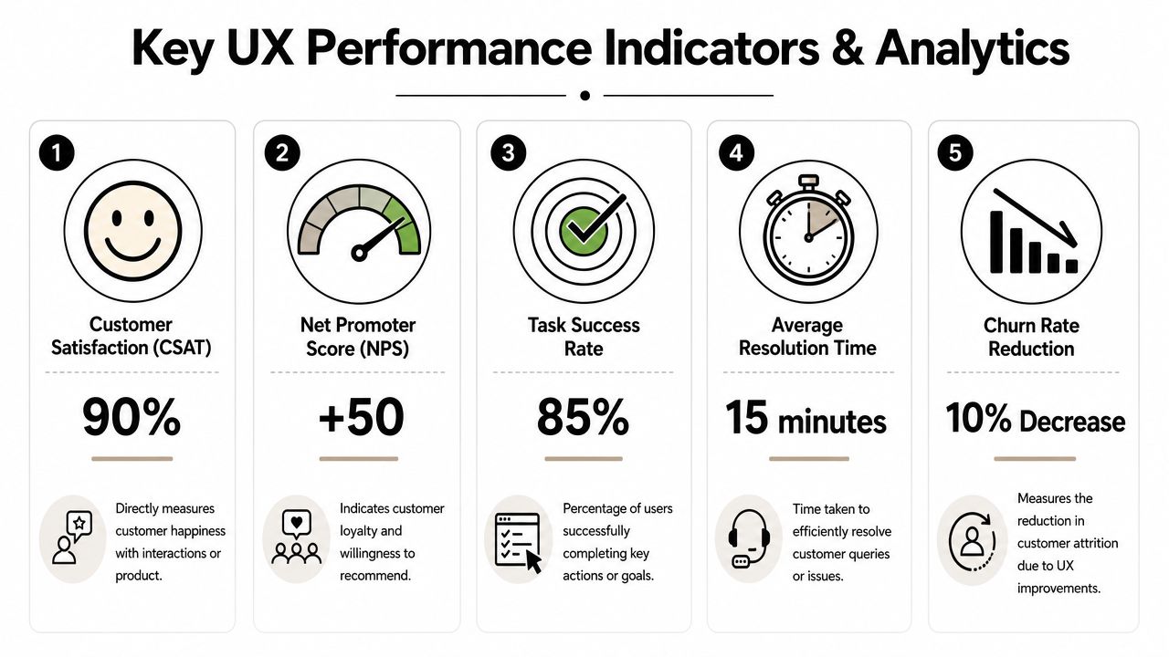
For community support, a useful KPI set includes:
KPIWhat it revealsFirst response timeHow long users wait before the system acknowledges themAverage resolution timeHow efficiently issues move from intake to closureTask successWhether users actually complete the support goalError frequencyWhere forms, flows, or agent processes break downAI resolution rateHow often automation truly resolves without creating extra workTicket volume by channelWhere support demand is rising or fragmentingSatisfaction by channelWhich environments feel easiest or hardest for users
The metric alone isn't the insight. The pattern is.
If first response time looks good but resolution time is poor, the team may be acknowledging quickly and solving slowly. If satisfaction drops in one channel, the issue may be channel design rather than agent quality. If AI resolution rises but repeat contacts also rise, the bot may be closing conversations without providing help.
A disciplined review cycle helps:
The biggest shift is organizational. UX stops being a vague quality discussion and becomes an operating discussion.
Leaders can point to where users get stuck, where moderation effort is wasted, and where automation reduces or increases friction. That makes it easier to justify staffing, workflow changes, documentation cleanup, and tooling investment without relying on instinct alone.
Teams that support users across Discord, Slack, Telegram, and the web need more than a ticket queue. They need one system for context, automation, handoffs, and analytics. Mava is built for that model, with a shared inbox, AI support agents, and multi-channel workflows that help community teams improve response quality without losing the human side of support.